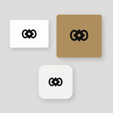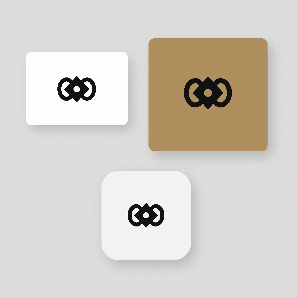
Example result illustrating this prompt's visual direction. Actual results may vary by model, reference image and settings.
 Requires Photo
  Design Prompts
  Logo Sketch to Brand Mark Concept Prompts
 Logo Sketch to Real-World Application Mockup Sheet
See a sketched mark in context by applying it to a business card, packaging, signage, and an app icon on one presentation sheet.
Prompt
Act as a brand presentation designer. I am uploading a photograph of a logo sketch. Build one clean symbol from the sketch, then show that symbol applied to four realistic but understated mockups arranged on a single neutral sheet: a white business card, a matte kraft box lid, a small exterior sign plate on a plain wall, and a rounded app icon tile. Keep the symbol identical in every application and scale it appropriately for each surface, respecting sensible clear space rather than filling the object edge to edge. Use soft natural daylight, shallow realistic shadows, a light grey backdrop, and blank unbranded objects so nothing competes with the mark. Do not add a brand name, tagline, address block, barcode, dummy paragraph text, or any other lettering to the objects. After the image, comment in plain text on how the mark performs at each size and whether it needs simplification for the smallest application.
Recommended:
ChatGPT


Upload your photo to the AI tool first, then use this prompt.
The prompt asks the model to preserve identity and key visual features.
How to use it
- Ask for plain unbranded objects so the mark is judged on its own rather than on styling.
- Request the app icon tile at a small display size to check real legibility.
- Ask which application performed worst, then commission a simplified variant for that use.
Common failure fixes
- If the mockups add fake text or logos of their own, restate that every object must stay blank except for the symbol.
- If the symbol is stretched to fit a surface, require uniform scaling with the original proportions locked.
- If the scene is over-styled with props and heavy shadows, ask for a plain backdrop and soft even daylight.