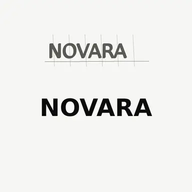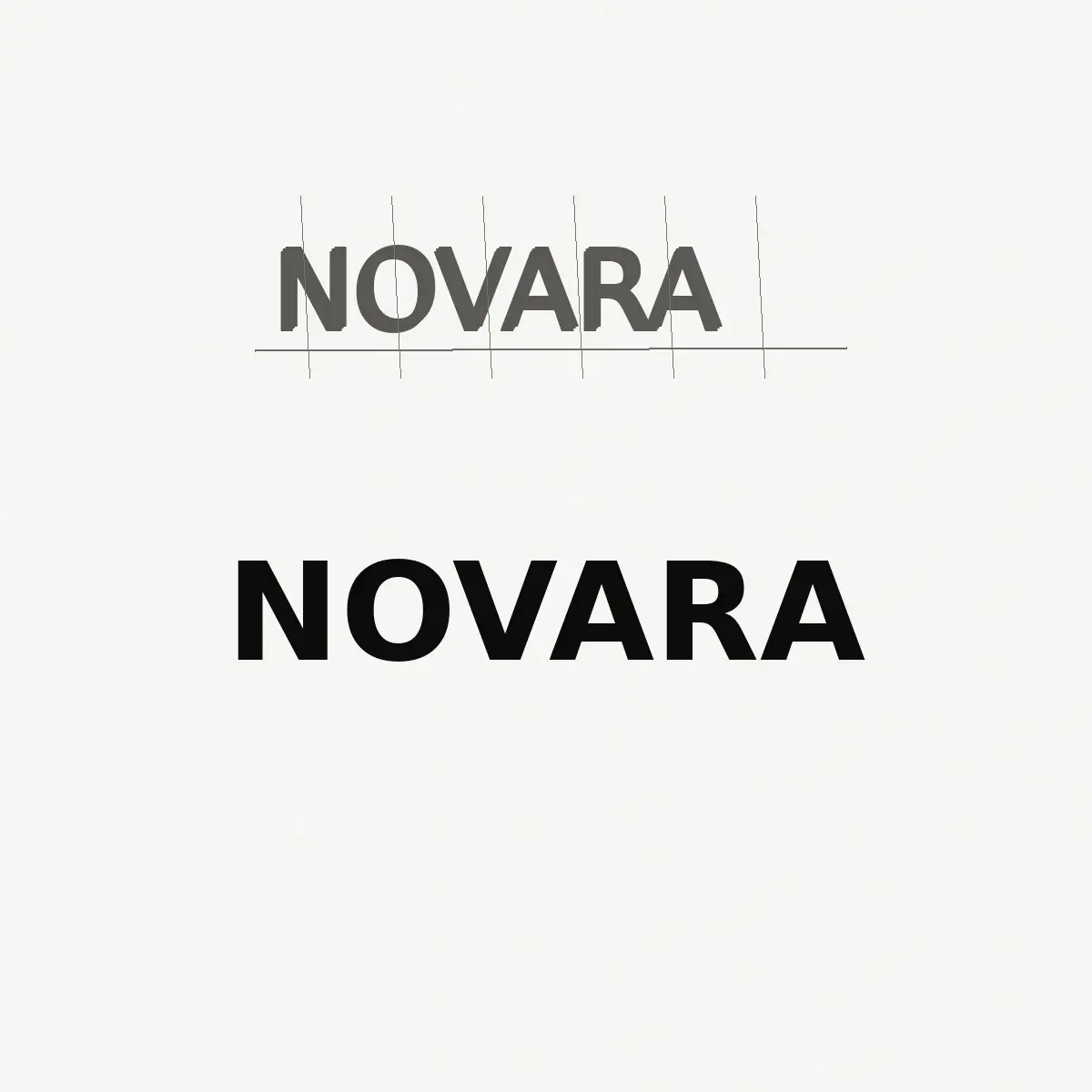
Example result illustrating this prompt's visual direction. Actual results may vary by model, reference image and settings.
 Requires Photo
  Design Prompts
  Logo Sketch to Brand Mark Concept Prompts
 Brand Name Lettering Sketch to Custom Wordmark Concept
Turn a photographed lettering sketch of a brand name into a refined custom wordmark with even rhythm, consistent weight, and clean spacing.
Prompt
Act as a type designer producing a custom wordmark. I am uploading a photograph of a hand-sketched brand name. First transcribe the name exactly as you read it and pause for my confirmation if any character is ambiguous. Then draw one refined wordmark of that name that follows the character of the sketch, matching whether it is geometric sans, humanist sans, slab, or high-contrast serif, and keeping the same capitalization pattern. Rebuild every letter with consistent stem weight, matched curve tension, even optical spacing rather than mechanical spacing, aligned baseline, and consistent overshoot on round letters. Tighten loose gaps, open tight pairs, and correct any letter that reads as a different character. Render the wordmark in solid black on a plain white background, horizontally centered with wide clear space, at a size where every letter is sharp. Do not add a symbol, tagline, underline, box, gradient, or texture. Finish with a plain-text note on which letter pairs you re-spaced and which letterforms you redrew.
Recommended:
ChatGPT


Upload your photo to the AI tool first, then use this prompt.
The prompt asks the model to preserve identity and key visual features.
How to use it
- Type the brand name in your message so the model never guesses at unclear handwriting.
- Name the intended type style if the sketch is ambiguous, for example geometric sans or high-contrast serif.
- Ask for a second version with slightly wider letter spacing to compare rhythm at small sizes.
Common failure fixes
- If letters are misspelled or invented, restate the exact name in capital letters and ask for a redraw with no substitutions.
- If spacing looks lumpy, ask for optical spacing adjustments naming the specific letter pairs that feel too tight or too loose.
- If the model adds an icon or underline, repeat that the output must be the lettering alone on plain white.