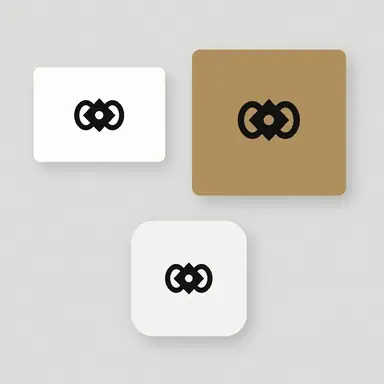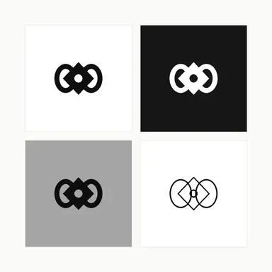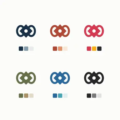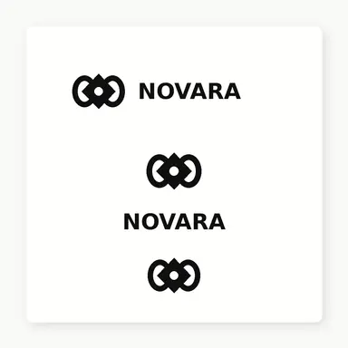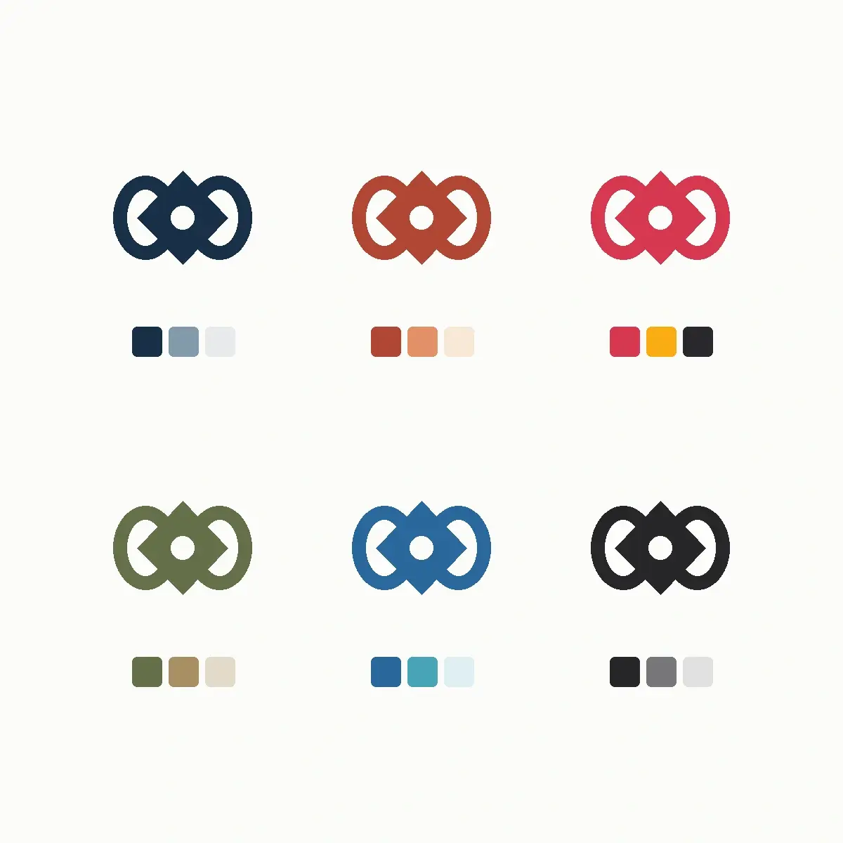
Example result illustrating this prompt's visual direction. Actual results may vary by model, reference image and settings.
 Requires Photo
  Design Prompts
  Logo Sketch to Brand Mark Concept Prompts
 Logo Sketch to Brand Color Palette Exploration
Test one sketched mark across several coherent color directions to see which palette suits the brand before committing.
Prompt
Act as a brand color strategist. I am uploading a photograph of a logo sketch, and I will describe the industry and the feeling the brand should convey. Build one clean symbol from the sketch, then present that same symbol six times in a tidy grid, each instance in a different color direction. Give each direction a primary color, a supporting secondary, and a neutral, and show a row of flat color swatch squares directly beneath each symbol. Keep the symbol drawing identical in every cell so only color changes. Choose directions that differ meaningfully from one another, such as a deep and restrained pairing, a warm and approachable pairing, a high-energy pairing, a muted earth pairing, a cool technical pairing, and a near-monochrome pairing. Ensure every combination keeps the symbol clearly readable against its background. Use a white sheet with equal spacing and no labels, headings, or hex codes inside the image. After the image, list each direction in plain text with its hex values and the mood it supports.
Recommended:
ChatGPT


Upload your photo to the AI tool first, then use this prompt.
The prompt asks the model to preserve identity and key visual features.
How to use it
- State the industry and two mood words so the color directions are grounded rather than random.
- Ask for hex values as text after the image, since colors rendered in an image are unreliable to sample.
- Request one refined direction expanded into light and dark background versions once you pick a favorite.
Common failure fixes
- If the palettes look alike, name the six directions explicitly and ask for clear separation between them.
- If the symbol drifts between cells, require the identical symbol geometry in every cell with color as the only variable.
- If a version loses contrast, ask for a minimum contrast check and a corrected background tone for that direction.